
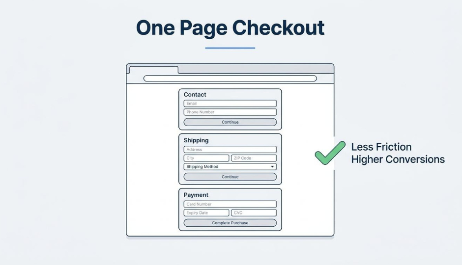
A one-page checkout is a checkout design that consolidates cart contents, contact information, shipping details, and payment fields into a single web page, eliminating the multi-step navigation that causes shoppers to drop off before completing a purchase.
This guide covers how one-page checkouts compare to multi-step flows, the measurable benefits they deliver, the essential page elements and optimization techniques that maximize conversions, mobile-specific design strategies, effective A/B testing methodology, post-launch metrics tracking, and how unified commerce platforms enhance the checkout experience.
One-page checkouts emerged as an alternative to multi-step flows that dominated ecommerce for over 17 years. The structural difference is visibility: shoppers see every required field at once rather than advancing through hidden steps, which directly reduces perceived complexity and page-load friction.
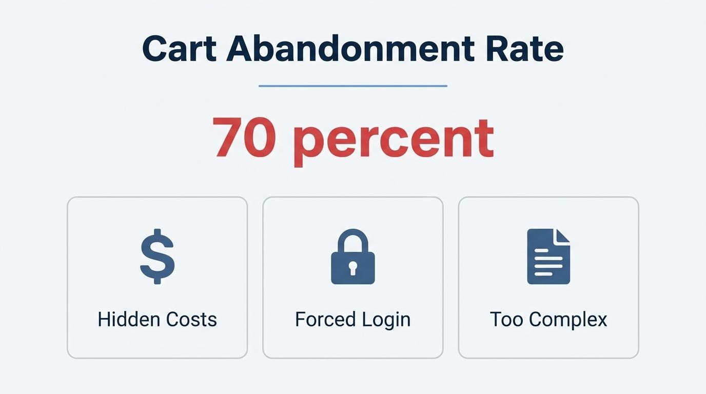
The conversion case is strong. The average cart abandonment rate sits at 70.22%, with complicated checkout processes, forced account creation, and hidden costs among the top drivers. A single-page layout addresses these triggers by making total costs, guest checkout options, and form requirements transparent from the start.
Getting the page elements right matters as much as the format itself. Order summary placement, inline shipping options, express payment buttons, trust badge positioning, coupon field handling, and address autocomplete each serve a specific friction-reduction role within the consolidated view.
Mobile optimization deserves its own focus. Mobile checkout abandonment runs 15 percentage points higher than desktop, and with mobile commerce accounting for the majority of ecommerce sales, layout stacking, thumb-friendly inputs, and wallet-based one-tap payments become essential rather than optional.
Sustained improvement requires disciplined A/B testing (one variable at a time, with proper statistical parameters) and continuous tracking of checkout conversion rate, abandonment rate, time to completion, and form error frequency. For brands operating on unified commerce platforms, shared customer records across checkout, CRM, and subscriptions reduce form friction further while enabling more precise optimization decisions.
A one-page checkout in ecommerce is a checkout design that consolidates every step of the purchase process onto a single web page. Instead of routing shoppers through separate screens for contact details, shipping, and payment, this layout displays all required form fields in one view. According to Baymard Institute, a one-page checkout shows cart contents, contact information, shipping details, and payment information simultaneously, eliminating the need for users to navigate between multiple pages.
The result is a shorter, more visible path from cart to confirmation. Shoppers can review and edit every section without waiting for new pages to load or wondering how many steps remain. For merchants, this format reduces the number of page transitions where buyers typically drop off, which is especially valuable on mobile devices where each additional screen introduces friction. Understanding this structure sets the stage for comparing it against multi-page alternatives and evaluating its specific benefits.
A one-page checkout differs from a multi-page checkout in structure, user flow, and perceived complexity. The sections below break down these differences across layout, historical context, and common UX gaps that persist in both formats.
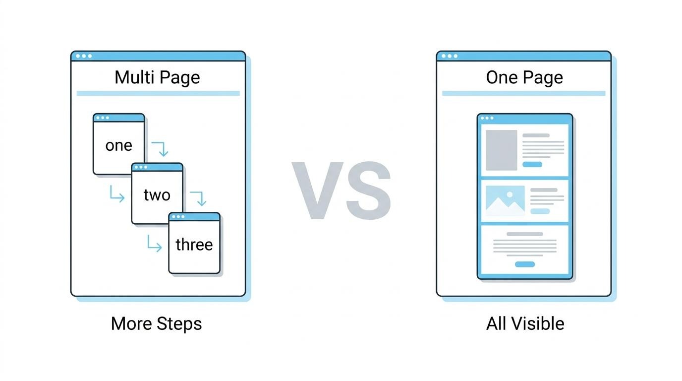
A one-page checkout presents all form elements on a single view. A multi-page checkout distributes those same elements across sequential pages, requiring users to navigate through separate steps for contact details, shipping, and payment. According to Nielsen Norman Group, this structural difference reduces the number of page transitions users must complete, which directly affects perceived friction and completion speed.
The core distinction is visibility. On a single page, shoppers see every required field at once, including cart contents, shipping options, and payment inputs. In a multi-page flow, each step is hidden until the user advances, which can create uncertainty about how many steps remain. For merchants selling straightforward products, this transparency often makes the single-page approach the more intuitive choice.
UX expert Luke Wroblewski has noted that multi-page, multi-step checkout flows were the standard approach for over 17 years before one-page designs gained meaningful adoption. That long dominance means many stores still default to multi-step flows, even when their product catalog and average order complexity do not require them.
Despite the shift toward consolidated layouts, common UX problems affect both formats. Baymard Institute found that 83% of ecommerce sites do not display shipping cutoff times as a countdown, instead relying on static text that forces shoppers to calculate deadlines manually. Whether a checkout spans one page or five, gaps like these erode the clarity gains that any layout redesign is meant to deliver.
The real differentiator is not page count alone; it is how well the chosen format reduces cognitive load for a store's specific audience. Understanding these structural and UX differences sets the stage for evaluating why many online stores are actively moving away from multi-step flows.
Online stores abandon multi-step checkout flows because each additional page creates friction that drives shoppers away. Forced account creation, perceived complexity, and slow page transitions all push buyers to leave before completing a purchase.
Multi-step checkouts compound several friction points that individually seem minor but collectively erode completion rates. According to a Baymard Institute survey of 1,026 US adults who shopped online in the last three months, 18% reported abandoning an order specifically because they did not want to create an account. When that barrier sits on its own dedicated page, it becomes a hard stop rather than a skippable option.
The core reasons stores move away from multi-step flows include:
For scaling brands processing real volume, even small percentage-point losses at each checkout step compound into significant revenue leakage. Consolidating everything onto one visible page removes those sequential exit points and gives shoppers a clear sense of how much effort remains. Understanding these friction points sets the stage for how a one-page checkout directly addresses each one.
The benefits of using a one-page checkout include lower cart abandonment, faster purchase completion, stronger mobile conversion, higher average order value, and simpler guest checkout. Each advantage addresses a specific friction point in the buying process.
A single-page checkout reduces cart abandonment by eliminating page transitions that create drop-off points. According to Baymard Institute, 17% of US online shoppers abandon orders specifically because the checkout process is too long or complicated.
Several friction points compound the problem on multi-step flows:
By displaying cart contents, shipping details, and payment fields on one view, a single-page layout gives shoppers full cost visibility before they commit. That transparency alone addresses the leading abandonment triggers. For merchants processing meaningful volume, even a small reduction in checkout friction translates directly to recovered revenue.
Fewer form fields speed up time to purchase by cutting the number of inputs a shopper must complete before placing an order. The average US checkout flow contains 23.48 form elements, yet optimized flows need only 12 to 14, according to Baymard Institute.
Reducing fields works because each unnecessary input adds cognitive load and typing time, particularly on mobile keyboards. Consolidating to a single page makes redundant fields more visible during design audits, so teams can remove them.
Practical reductions include combining first and last name into one field, hiding optional fields behind a toggle, and enabling address autocomplete. Every field removed shortens the path from cart to confirmation.
A consolidated checkout improves mobile conversion by removing page reloads that feel slow on cellular connections and by keeping all inputs within a continuous scroll. With mobile commerce projected to account for 73% of all ecommerce sales by 2026, according to EasyApps Ecommerce, optimizing for small screens is no longer optional.
Key mobile-specific gains from consolidation include:
Given that 64% of desktop sites and 63% of mobile sites score "mediocre" or worse on checkout UX, consolidating to one page is one of the highest-impact moves a mobile-heavy brand can make.
A streamlined checkout affects average order value by creating space for contextual upsell and cross-sell elements without adding extra steps. When shoppers see their full order on one page, inline prompts for complementary products or free-shipping thresholds feel native rather than interruptive.
Free shipping bars are especially effective in this context. According to EasyApps Ecommerce, free shipping bars increase average order value by 20 to 30%. A single-page layout makes the progress-to-threshold visible alongside the cart, encouraging shoppers to add items before completing payment. That visibility is harder to achieve when the cart summary lives on a separate page from the shipping and payment steps.
One-page checkout simplifies guest checkout by removing the separate account-selection step that often buries the guest option. According to Baymard Institute, 62% of leading ecommerce sites fail to make guest checkout the most prominent choice, causing shoppers to overlook it entirely.
On a single-page layout, all fields appear at once. There is no dedicated gate asking shoppers to choose between creating an account, signing in, or continuing as a guest. The shopper simply fills in their contact, shipping, and payment details and completes the order. Account creation can be offered post-purchase with a single password-set prompt, converting guests without adding pre-purchase friction.
This approach directly addresses a well-documented barrier: 18% of shoppers abandon checkout because they do not want to create an account.
Beyond reducing abandonment, a well-optimized checkout also sets the stage for understanding which page elements to include and how to arrange them.
The potential drawbacks of a one-page checkout include slower initial page loads, visual overwhelm from too many form fields, limited analytics granularity, and weaker performance for complex or high-SKU orders. These trade-offs do not disqualify the format, but they require deliberate design decisions. A one-page layout consolidates every checkout element into a single view, which creates specific UX and technical challenges that multi-step flows handle differently.
When every field, payment option, shipping selector, and order summary renders at once, the page carries a heavier payload. According to EasyApps Ecommerce, every 1-second delay in load time reduces conversions by 7%. On mobile connections, where latency compounds quickly, that single heavy page can feel sluggish if images, scripts, and payment widgets all load synchronously. Lazy loading and deferred script execution help, but they add implementation complexity that a sequenced multi-page flow avoids by default.
Visual density is the second concern. Displaying contact fields, shipping options, billing details, and the order summary simultaneously can overwhelm shoppers, particularly first-time visitors unfamiliar with the store. When users perceive a checkout as complex, they abandon it; perceived complexity drives abandonment even when the actual field count is reasonable. Careful use of collapsible sections, progressive disclosure, and clear field labeling counteracts this, yet it demands more upfront UX work than simply splitting fields across pages.
Analytics precision also suffers. Multi-step checkouts generate a distinct URL or event for each stage, making it straightforward to identify exactly where shoppers drop off. A one-page checkout compresses that funnel into one pageview. Without custom event tracking on individual form sections, merchants lose visibility into whether users stall at shipping selection, payment entry, or somewhere else entirely.
Finally, stores selling configurable products, B2B orders with purchase-order fields, or carts with many line items may find a single page impractical. The more conditional logic and fields a checkout requires, the harder it becomes to keep one page scannable. For brands at this complexity level, a hybrid approach, where the page is single-view but uses accordion sections to reveal fields progressively, often performs better than a fully flat layout.
Understanding these limitations helps merchants design around them rather than discover them after launch.
A one-page checkout page should include an order summary, multiple payment methods, inline shipping options, trust badges, a coupon field, and address autocomplete. Each element serves a specific role in reducing friction and building buyer confidence.
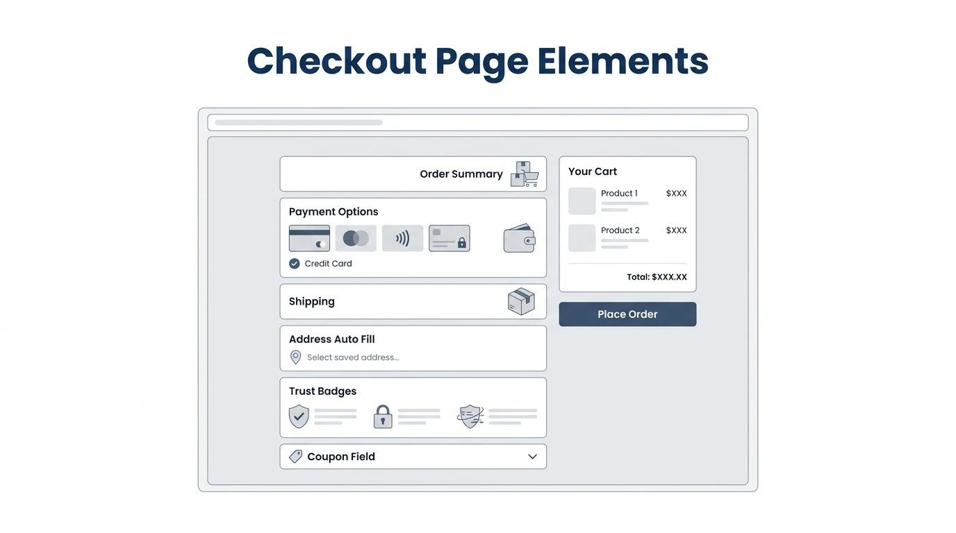
The order summary should appear in a persistent, visible position on the page, typically as a sticky sidebar on desktop or a collapsible panel at the top on mobile. Keeping product names, quantities, thumbnail images, and the running total visible at all times prevents shoppers from leaving the checkout to verify what they ordered. When the summary updates in real time as users apply discounts or change shipping methods, it eliminates guesswork about the final price. For single-page layouts, anchoring the summary to the right column ensures it stays in view alongside the form fields without requiring scrolling. This constant visibility is one of the simplest ways to reduce mid-checkout hesitation.
The payment methods visible at checkout should include credit and debit cards alongside express options such as Apple Pay, Google Pay, and platform-native wallets. According to a 2025 report by Mordor Intelligence, Apple Pay and Google Pay processed a combined USD 1.2 trillion that year, up 28% year over year, with rotating token IDs curbing fraud and boosting merchant confidence. Displaying express buttons above the standard card fields lets returning customers bypass form entry entirely. Buy-now-pay-later options like Klarna or Afterpay deserve placement directly below wallets since they address price-sensitivity friction. Each method should show its recognizable logo; unfamiliar icons create hesitation rather than confidence.
Shipping options should be displayed inline as a set of radio buttons directly within the single-page form, positioned between the address fields and payment section. Each option should show the carrier name, cost, and an estimated delivery date rather than vague speed labels like "Standard" or "Express." Displaying actual arrival dates removes the mental math that causes uncertainty. If free shipping is available above a threshold, a progress bar showing how close the cart total is to qualifying can motivate adding another item. Placing shipping choices inline, rather than behind an expandable accordion, keeps total cost visible before customers reach the payment step; this matters because hidden costs remain the top driver of checkout abandonment.
Trust badges and security indicators belong near the payment fields, where buyers enter sensitive card details. Placing SSL certificates, PCI compliance seals, and recognized payment logos (Visa, Mastercard, Norton Secured) adjacent to the card number input directly addresses the moment of highest anxiety. According to Baymard Institute, 19% of checkout abandonment stems from users not trusting a site with their credit card information. A secondary placement near the final "Place Order" button reinforces confidence at the point of commitment. Avoid scattering badges across the entire page; concentrated placement near financial inputs carries more weight than decorative repetition elsewhere.
Coupon and discount fields should be handled as a collapsed, single-line text link (e.g., "Have a promo code?") rather than a prominent open input box. A visible empty field prompts customers without codes to leave the page and search for one, creating unnecessary abandonment risk. When clicked, the link expands into a compact inline field with instant validation that confirms or rejects the code immediately. Successful applications should update the order summary total in real time so the discount feels tangible. For stores running automatic discounts, displaying the applied savings without requiring manual entry at all is the cleanest approach.
Address autocomplete plays the role of reducing keystrokes, preventing typos, and accelerating form completion, especially on mobile devices. According to a report by Biscuits Bundles, address autocomplete reduces the number of keystrokes required for address entry by 50 to 70% and virtually eliminates address-entry errors on mobile checkout forms. Integrating a service like Google Places API populates city, state, and ZIP fields after the shopper types just a few characters of their street address. This is particularly valuable on smartphones, where small keyboards make manual entry slow and error-prone. Fewer input errors also mean fewer failed deliveries and lower return rates downstream.
With the right elements in place, the next step is tuning each one for maximum conversions.
You optimize a one-page checkout for higher conversions by reducing form fields, validating inputs in real time, showing progress visually, displaying errors inline, lazy loading non-critical elements, and offering express payment buttons.
Reducing form fields lifts completion rates by lowering perceived complexity and shortening time to purchase. According to Baymard Institute, the average US checkout flow contains 23.48 form elements by default, yet ideal flows can be as short as 12 to 14 elements. Cutting nearly half the visible inputs removes hesitation before it starts.
Effective field-reduction tactics include:
For most merchants, trimming even three or four unnecessary fields produces a measurable lift because each removed field eliminates one decision point where a buyer might hesitate.
Real-time input validation prevents errors by confirming or correcting entries the moment a shopper leaves each field. Instead of waiting until form submission to flag problems, inline validation catches typos in email addresses, incomplete phone numbers, or invalid zip codes immediately.
This approach reduces frustration because users fix mistakes in context rather than scrolling back through a full-page error summary. When combined with clear visual cues (green checkmarks for valid entries, subtle red highlights for issues), real-time validation keeps forward momentum intact. The result is fewer failed submissions, fewer page reloads, and a checkout that feels responsive rather than punishing.
Progress indication works on a single page by showing labeled sections (contact, shipping, payment) with visual markers that update as shoppers complete each group. Although no page transitions occur, collapsible accordions or highlighted step labels communicate how much remains.
This matters because 18% of checkout abandonment stems from the process feeling too complicated. A visible section structure counteracts that perception, even when all fields technically live on one page. Sticky micro-progress bars or checkmarks beside completed sections give the same psychological reward as advancing through multi-page steps, without the load-time cost.
Error messages should be displayed inline, directly adjacent to the field that triggered the issue. Positioning the message immediately below or beside the input ensures shoppers see exactly what needs correcting without scanning the entire form.
Effective inline error messages follow these principles:
Vague or page-level error banners force users to hunt for problems, which adds friction at the worst possible moment in the funnel.
Lazy loading keeps the checkout page fast by deferring non-critical assets (product thumbnails, trust badge images, third-party scripts) until the shopper scrolls to them or the primary form fields finish rendering. According to EasyApps Ecommerce research, every 1-second delay in load time reduces conversions by 7%.
Since a one-page checkout loads all sections simultaneously, the total page weight is inherently higher than any single step in a multi-page flow. Lazy loading offsets this by prioritizing the contact and payment fields first. Critical JavaScript executes immediately while analytics pixels, review widgets, and below-fold imagery load asynchronously. The checkout feels instant even when the full page carries more assets.
Offering express payment buttons cuts friction by letting returning shoppers bypass the entire form. Express options such as Apple Pay, Google Pay, and similar wallet-based methods use pre-saved payment and shipping data, reducing checkout to a single biometric tap.
According to EasyApps Ecommerce research, express checkout options increase checkout conversion by 10 to 50% by eliminating manual form entry entirely. Placing these buttons above the fold, before the traditional form fields begin, captures high-intent buyers who already have wallet credentials stored on their device. For mobile shoppers especially, where typing remains cumbersome, express buttons transform a multi-field process into a one-tap completion.
With these optimization tactics in place, adapting the layout specifically for mobile screens unlocks even greater gains.
You optimize a one-page checkout for mobile shoppers by adapting layout, input design, and payment options to small-screen constraints. The following subsections cover layout adjustments, touch-friendly form inputs, and mobile wallet placement.
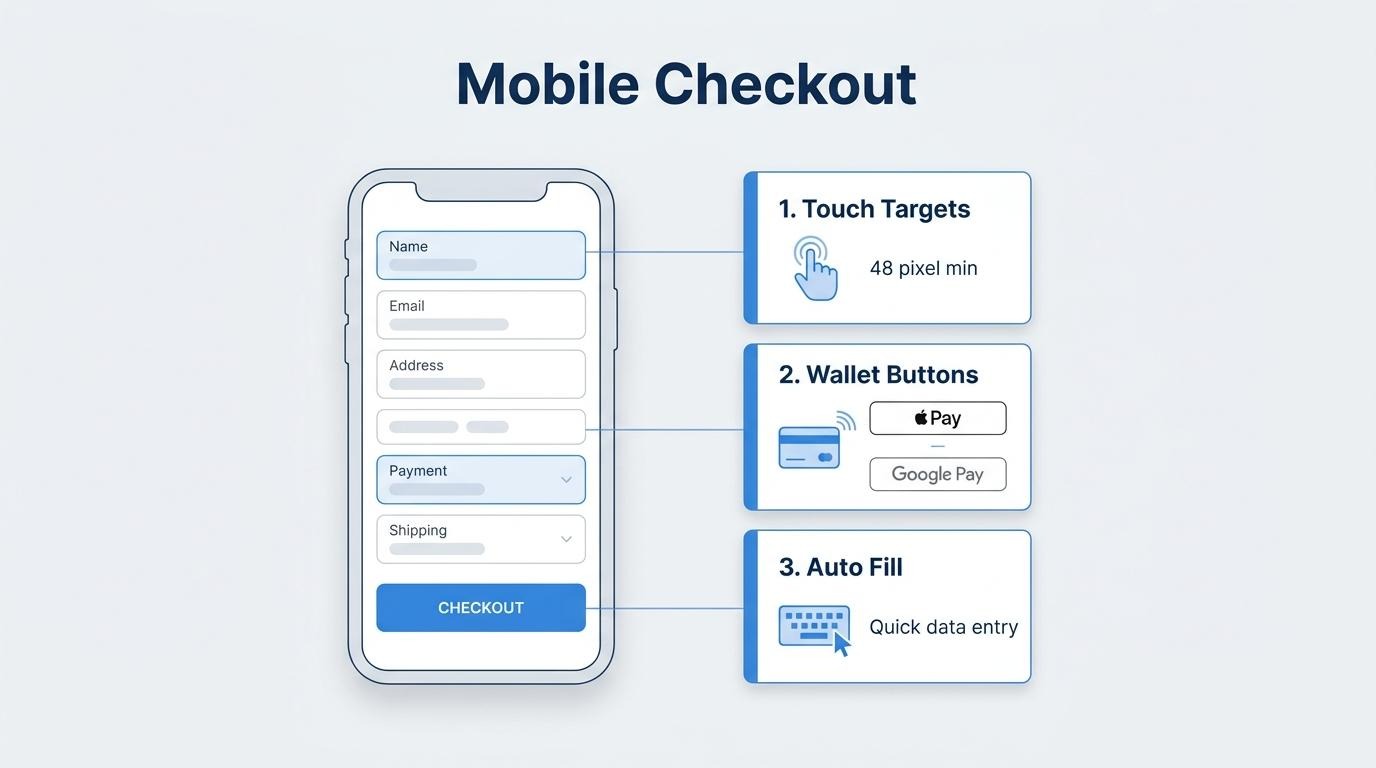
Layout changes that help on smaller screens include stacking form sections into a single vertical column, collapsing the order summary into an expandable accordion, and sizing all tap targets to at least 48x48 pixels. On mobile, page-to-page navigation with form re-rendering feels sluggish; a single-page layout with smooth in-page transitions eliminates that friction.
Key mobile layout adjustments include:
Keeping the visual hierarchy clean matters more than cramming everything into view at once. When shoppers can scan the page in a single scroll without pinching or zooming, perceived complexity drops significantly.
Touch-friendly inputs should be designed with generous tap targets, appropriate keyboard types, and inline validation that responds immediately. Inputs sized below 48x48 pixels cause frequent mistaps, especially when form fields sit close together on a 5-to-7-inch display.
Effective touch-friendly input design follows these principles:
For most mobile checkout forms, address autocomplete is the single highest-impact input optimization. It removes the most tedious part of the form while also improving data accuracy, a combination that directly reduces abandonment.
A mobile wallet button should replace form entry when biometric authentication and pre-saved payment data can eliminate manual input entirely. According to a 2025 Mordor Intelligence report on the m-commerce market, Apple Pay and Google Pay processed a combined USD 1.2 trillion that year, up 28% year over year, with rotating token IDs curbing fraud and boosting merchant confidence.
Mobile wallet buttons earn priority placement when:
Rather than hiding wallet options below the fold, placing Apple Pay and Google Pay buttons at the top of the checkout page lets returning shoppers complete a purchase in one tap. For stores where mobile traffic dominates, this single change often delivers the largest measurable conversion lift across the entire checkout flow.
You A/B test a one-page checkout effectively by defining a clear hypothesis, isolating one variable per test, setting statistical parameters before launch, and running the experiment long enough to collect reliable data. The following sub-sections cover hypothesis formation, test configuration, runtime requirements, and common pitfalls.
A/B testing a checkout page is not about randomly swapping button colors. According to Nielsen Norman Group, only one in every seven A/B tests produces a winning result, and that ratio drops further when tests lack a data-based hypothesis grounded in user research. This means the setup and methodology matter far more than the volume of tests you run.
Start by identifying one specific friction point on your checkout page, such as form field count, payment button placement, or the visibility of your guest checkout option. Build a hypothesis that predicts how a single change will affect a measurable outcome like checkout completion rate, time to purchase, or error frequency.
Before launching, define three parameters:
These three inputs together determine the sample size your test requires. Running a test without calculating this upfront risks ending the experiment too early or drawing conclusions from noise rather than signal.
A/B tests should run for at least one to two full weeks regardless of how quickly traffic accumulates. Weekday and weekend shopping behavior differs significantly, and ending a test mid-cycle skews results. For checkout specifically, seasonal patterns and promotional periods also distort data, so avoid launching tests during flash sales or holiday spikes.
There are several scenarios where A/B testing is not the right method:
When traffic is insufficient, qualitative methods such as session recordings, heatmaps, and user surveys provide more actionable insight than an underpowered split test.
For brands with meaningful checkout volume, the most productive A/B tests on one-page checkouts tend to focus on high-impact elements: express payment button positioning, inline error message placement, shipping cost visibility, and the number of visible form fields. Test one element, measure its impact on completion rate, document the result, and move to the next variable. This disciplined, sequential approach compounds small gains into meaningful conversion improvements over time.
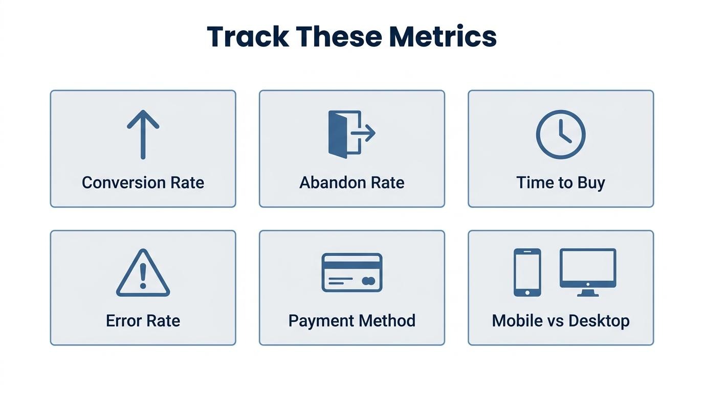
The checkout metrics you should track after launching cover conversion performance, abandonment behavior, speed, and revenue per transaction. These indicators reveal whether your one-page checkout design is working or needs adjustment.
Reviewing these metrics weekly during the first month after launch establishes reliable baselines. For brands operating at scale, tracking these inside a single analytics layer rather than across disconnected tools prevents blind spots in the data.
Understanding what to measure sets the foundation; the next step is connecting checkout data to your broader commerce operations.
Your checkout experience changes significantly when it lives inside your commerce platform, because every transaction draws from shared customer, inventory, and marketing data in real time. The sections below cover unified data benefits and key takeaways.
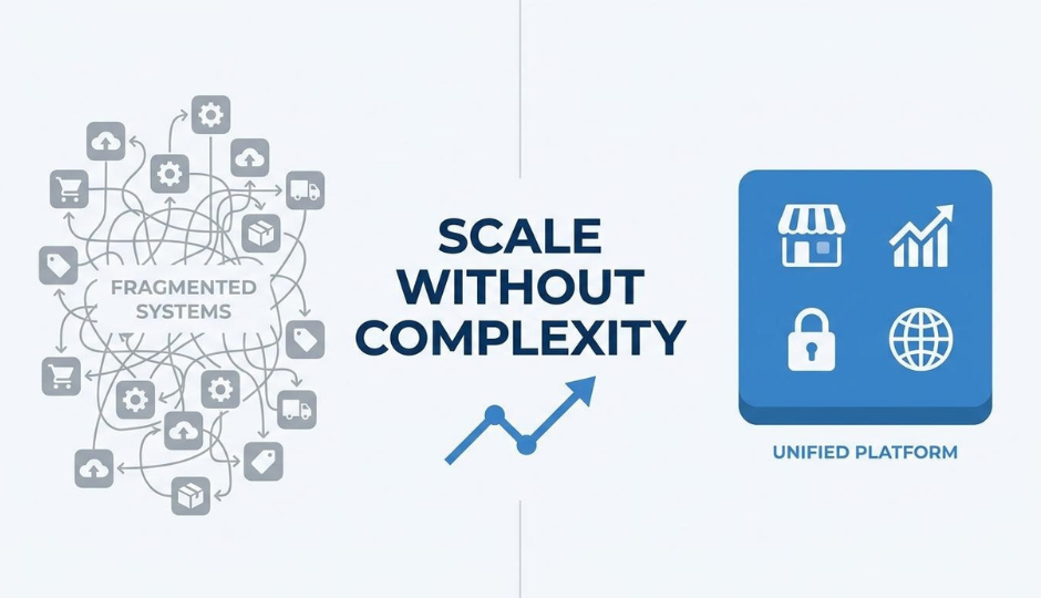
What happens is that checkout, CRM, and subscriptions sharing one customer record eliminates the data silos that fragmented tool stacks create. When a returning subscriber reaches checkout, their shipping preferences, loyalty tier, and payment method are already populated, reducing form friction to near zero.
This consolidation also means subscription upsells, personalized discounts, and post-purchase lifecycle triggers fire from the same data source rather than syncing across disconnected apps. According to Nielsen Norman Group, A/B testing is not suited for low-traffic pages or understanding why user behavior changed, making it most effective when combined with qualitative research. That principle applies directly here: unified platforms let merchants pair quantitative checkout metrics with qualitative CRM insights from a single record, producing more actionable optimization decisions.
For brands processing real volume, this single-record architecture removes the reconciliation overhead that grows with every additional tool in the stack.
The key takeaways about one-page checkouts center on three principles: reduce friction, match the format to your audience, and measure continuously.
The most effective one-page checkouts are not simply fewer pages. They are deliberate design decisions where every visible element earns its place by reducing cognitive load or building purchase confidence.
.png)

