A high-converting landing page is a standalone web page designed around a single offer, a single audience, and a single call to action, built to turn visitors into customers at rates that exceed site-wide averages. This guide covers the core structural pillars of conversion-focused pages, best practices for copy and design, layout strategy by campaign goal, CTA optimization, social proof deployment, A/B testing methodology, performance measurement, common conversion killers, and unified data infrastructure.
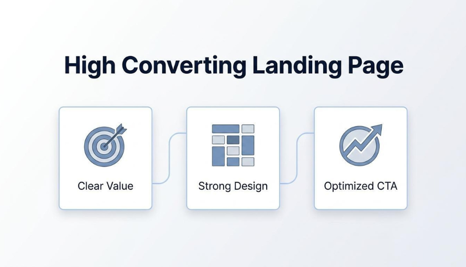
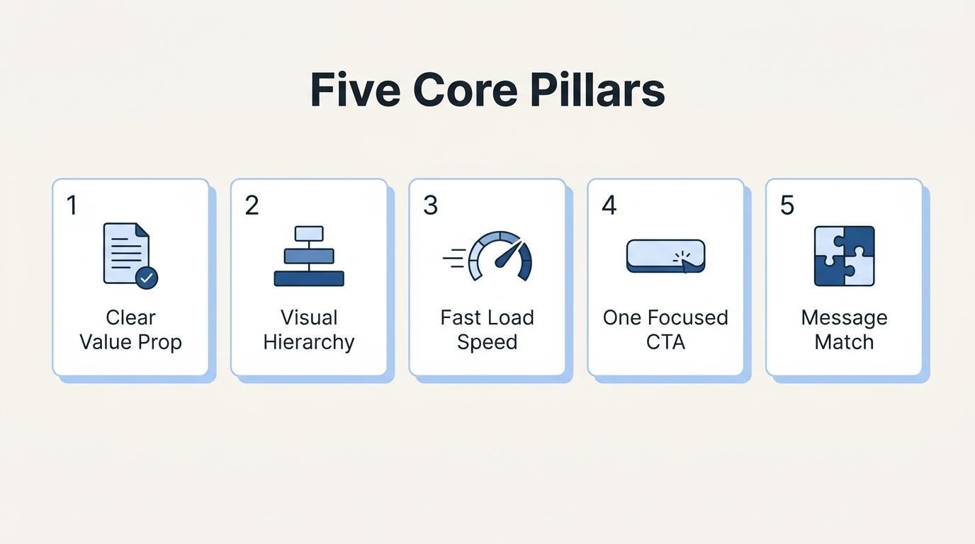
Every high-converting page starts with five foundational pillars: a clear value proposition, strong visual hierarchy, fast load speed, one focused CTA, and tight message match between the ad and the page. Each pillar removes a specific barrier that causes visitors to leave before acting.
Best practices bring those pillars to life through benefit-driven headlines, scannable copy, purposeful imagery, strategically placed trust signals, minimal form fields, and the removal of site navigation that competes with the conversion goal.
Layout and campaign context shape how these elements are sequenced. Above-the-fold hierarchy, below-the-fold persuasion flow, and page length all shift depending on whether the goal is a product launch, lead capture, subscription signup, or seasonal promotion.
CTA copy, placement, and color contrast work together to direct attention at the moment a visitor is ready to act; social proof (testimonials, quantitative data, and trust badges) reduces perceived risk right before that moment arrives.
A/B testing separates real conversion lifts from statistical noise, but only when tests prioritize high-impact elements, run for sufficient duration, and meet predefined significance thresholds. Performance measurement then connects conversion rate, bounce rate, cost per conversion, and form completion rate to industry-specific benchmarks rather than universal averages.
Common mistakes (competing messaging, slow mobile load times, and excessive form fields) quietly erode results even on well-designed pages. Unifying CRM, storefront, and marketing data into one customer layer eliminates the sync lag that weakens personalization and delays optimization cycles.
The core pillars of a high-converting landing page are a clear value proposition, strong visual hierarchy, fast load speed, a single focused call to action, and tight message match between ad and page. Each pillar addresses a specific conversion barrier.
A clear value proposition drives conversions by telling visitors exactly what they get, why it matters, and why this offer beats alternatives. It answers the visitor's first question: "Is this for me?"
Effective value propositions share several traits:
Without a distinct value proposition, even well-designed pages lose visitors to confusion or indifference. Every other pillar on the page exists to reinforce this single promise. For most campaigns, spending more time refining the value proposition yields larger conversion gains than redesigning the page layout.
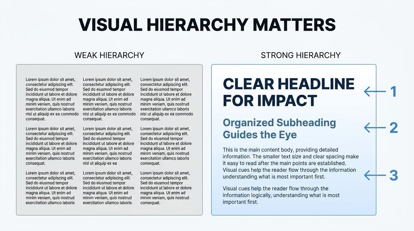
Visual hierarchy is essential on a landing page because it controls where visitors look, what they read first, and how quickly they find the action you want them to take. According to the Interaction Design Foundation, visual hierarchy is the principle of arranging elements so that people instantly recognize their order of importance, guiding attention, reducing confusion, and building trust.
The key tools for establishing hierarchy include:
When a page lacks clear hierarchy, visitors struggle to determine where to look. That friction alone can suppress conversions before the offer is even evaluated.
Page load speed affects landing page performance by directly influencing whether visitors stay long enough to see the offer. Slow pages increase bounce rates and suppress conversion rates before any design or copy element gets a chance to work.
A study published in MDPI's Analytics Journal found that mobile mean PageSpeed Insights scores averaged just 38.656, compared to a desktop mean of 69.615, a gap of over 30 points. Mobile visitors face significantly longer waits, and since the median dedicated landing page converts at 4.02% according to the Unbounce 2026 Conversion Benchmark Report, every extra second of load time erodes that baseline. Compressing images, minimizing render-blocking scripts, and using a CDN are non-negotiable starting points for any page expected to convert.
A single focused call to action plays the role of eliminating decision paralysis and directing all visitor attention toward one conversion goal. Multiple CTAs compete for clicks, split attention, and reduce overall conversion rates.
Effective single-CTA pages follow these principles:
Removing secondary navigation links and competing offers reinforces this focus. A page with one clear next step converts more reliably than a page offering three, because every additional choice introduces hesitation.
Message match between ad and landing page matters because it confirms the visitor landed in the right place, reducing bounce rates and reinforcing the intent that triggered the click. According to the Unbounce Marketing Glossary, message match describes how well your landing page copy and design matches the copy and design of the ad that brought your visitor there, serving as a critical component for ad success.
Poor message match creates cognitive friction. If an ad promises "50% off running shoes" but the landing page opens with a generic brand story, visitors lose trust immediately. Strong message match aligns three elements:
With these foundational pillars in place, the next step is applying the specific best practices that bring each one to life.
Every landing page should follow best practices in headline writing, persuasive copy, visual media, trust signals, form design, and navigation removal. The sections below cover each practice in detail.
You should write headlines that capture attention by matching the visitor's intent and communicating one clear benefit immediately. The headline is the first element most users read, so it must align with the ad or link that drove the click.
Effective attention-capturing headlines share several traits:
Testing headline variations is one of the highest-impact optimizations available, since even small phrasing changes can shift conversion rates meaningfully.
Landing page copy becomes persuasive and scannable when it leads with benefits, uses plain language, and breaks content into short visual blocks. Visitors rarely read every word; instead, they scan for the information that confirms a purchase or sign-up decision.
To achieve both persuasion and scannability:
Copy that mirrors the visitor's own vocabulary tends to feel more relevant, which reduces bounce rates and keeps attention focused on the call to action.
You should use images and video to support the offer by showing the product in context, demonstrating outcomes, and reinforcing the headline's promise visually. Generic stock photography weakens credibility, while specific imagery builds confidence in what the visitor will receive.
Strong visual media practices include:
When visuals tell the same story as the copy, the page feels cohesive rather than cluttered.
You should place trust signals and social proof in high-visibility zones where visitors naturally look before making a decision. According to the Interaction Design Foundation, people in Western cultures tend to scan pages in F-patterns or Z-patterns, meaning key trust elements belong along top and left-aligned areas where eyes land first.
Effective placement follows a few principles:
Because social cues, perceived risk, and the way information is presented all influence behavior, placing proof elements where scanning naturally occurs reduces hesitation at the exact moment it matters most.
You reduce friction in landing page forms by asking only for the information required to fulfill the offer. Every additional field increases the cognitive effort a visitor must invest, which raises abandonment likelihood.
Practical steps to minimize form friction include:
For most lead-generation pages, fewer fields consistently outperform longer forms. The data you sacrifice upfront can often be collected later through follow-up sequences.
You should remove navigation from landing pages because every additional link competes with the primary call to action. Navigation menus give visitors an exit path that pulls them away from the conversion goal the page was built to achieve.
A landing page serves one purpose: to convert a specific audience on a specific offer. Site-wide navigation introduces competing destinations, diluting focus and lowering completion rates. When visitors arrive from a paid ad or email campaign, the page should guide them toward a single action rather than inviting exploration.
The only links that belong on a landing page are the CTA and any legally required disclosures. Removing everything else keeps attention locked on the offer and the decision at hand.
With these foundational practices in place, layout and section sequencing determine how effectively visitors move toward conversion.
You structure a landing page layout for conversions by prioritizing a clear above-the-fold hierarchy, sequencing persuasion sections logically below it, and choosing the right page length for your offer complexity.
Above the fold should appear the headline, a supporting subheadline, a hero image or video, and one primary call-to-action button. These four elements form the first impression that determines whether visitors scroll or leave.
The headline states the value proposition in benefit-driven language. The subheadline adds specificity, clarifying who the offer serves or what outcome it delivers. A high-quality hero visual reinforces the promise, while the CTA button uses contrasting color and action-oriented copy.
According to the Interaction Design Foundation, larger elements command more attention than smaller ones; viewers notice a headline in 44-point text before they find a footnote in 12-point. This principle means your headline should dominate the visual space, with supporting elements sized proportionally below it. For most e-commerce offers, keeping this section clean and single-focused outperforms cluttered layouts every time.
You sequence sections below the fold by following the visitor's natural decision-making process: establish credibility, deepen the value proposition, address objections, then prompt action.
A proven below-the-fold sequence includes:
Each section should contain a single persuasive idea. Mixing multiple arguments within one section dilutes focus and slows scanning, which is particularly damaging on mobile where vertical space is limited.
Long-form landing pages work best for high-commitment offers, while short-form pages suit low-friction conversions.
The deciding factor is the gap between visitor awareness and purchase confidence. When that gap is large, more content is needed to build trust and answer questions before the conversion point. When visitors arrive warm, with high intent from a targeted ad, shorter pages reduce unnecessary friction.
Matching page length to offer complexity prevents two common failures: overwhelming ready-to-buy visitors with excessive content, or underwhelming skeptical visitors with too little proof.
Landing page design differs by campaign goal because each objective requires distinct page elements, layouts, and calls to action. The sections below cover product launches, lead generation, subscription offers, and seasonal promotions.
A product launch landing page should be designed around anticipation, education, and a single conversion action. The page needs to answer three questions immediately: what is the product, why does it matter, and how can visitors get it.
Key elements for product launch pages include:
Because launch traffic often comes from paid ads, message match between the ad creative and the landing page headline directly impacts whether visitors stay or bounce. For brands managing launches alongside storefront operations, keeping the landing page data connected to the same customer record simplifies post-launch retargeting.
What works best for lead generation landing pages is minimizing friction while maximizing the perceived value of the offer. Lead gen pages convert visitors into contacts, so the exchange must feel worthwhile.
Effective lead generation pages share these characteristics:
According to the Baymard Institute, the average US checkout flow contains 23.48 form elements displayed by default, yet an ideal flow can be as short as 12 to 14 elements. Lead gen forms should apply the same reduction principle, since every additional field increases abandonment risk.
You optimize a subscription offer landing page by emphasizing recurring value, flexible terms, and long-term savings over one-time purchase alternatives. Subscribers need to understand both the immediate benefit and the ongoing advantage.
Essential components include:
For brands running native subscription features within their commerce platform, the landing page can pull real-time pricing and plan details without relying on third-party app embeds that slow load times. Subscription pages benefit from addressing the most common objection upfront: "What if I want to cancel?"
A seasonal promotion landing page should include urgency-driven elements, simplified navigation, and a single promotional offer. Seasonal pages serve time-sensitive campaigns where the window for conversion is narrow.
Core elements are:
According to the HubSpot State of Marketing Report (2026), Conversion Rate Optimization is the second most used optimization technique among marketers at 50%, just one percent behind audience segmentation refinement. Seasonal pages are ideal candidates for rapid CRO testing because their short lifespan creates natural experiment windows.
With campaign-specific design principles established, the next step is crafting calls to action that drive clicks.
You write calls to action that convert by combining action-driven button copy, strategic page placement, and high-contrast design. The sections below cover effective CTA copy, optimal placement for click-through rates, and how color and contrast shape engagement.
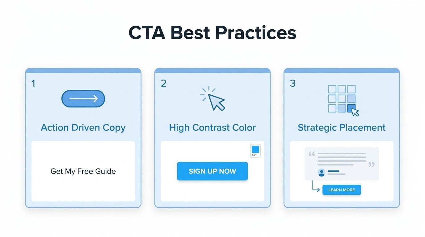
CTA button copy is effective when it uses specific, action-oriented language that tells visitors exactly what they will receive. Generic phrases like "Submit" or "Click Here" create ambiguity. Stronger alternatives name the outcome directly, such as "Get My Free Guide," "Start Your Trial," or "Reserve My Spot."
First-person phrasing ("my" instead of "your") tends to reinforce ownership and personal relevance. Urgency modifiers like "now" or "today" can lift response rates when the offer genuinely warrants immediacy. The most reliable approach is keeping button text under five words while front-loading the verb; this reduces cognitive effort and makes the next step unmistakable.
CTA placement influences click-through rates by determining whether visitors encounter the button at the moment they are most ready to act. According to the Interaction Design Foundation, people in Western cultures tend to scan pages in F-patterns or Z-patterns, moving from top-left to bottom-right. Positioning primary CTAs along these natural scan paths increases visibility without requiring visitors to search.
Above-the-fold placement captures high-intent visitors immediately, while a repeated CTA after key benefit sections catches those who need more persuasion before committing. For longer landing pages, placing a secondary CTA near social proof or testimonial blocks often performs well because trust has already been established at that point in the scroll.
CTA color and contrast affect engagement because strong visual differentiation draws the eye directly to the button. The Interaction Design Foundation notes that bold light-dark differences make elements stand out, which is why contrast forms a critical part of accessible, action-oriented design.
A CTA button should be the single most visually prominent element in its viewport. This means choosing a color that contrasts sharply with the page background and surrounding elements rather than blending into the brand palette. Orange on white, green on dark gray, or any high-saturation hue against a neutral field works because it creates an unmistakable focal point. Testing CTA color in isolation rarely produces dramatic lifts; the real gains come from ensuring the button's contrast ratio makes it impossible to overlook.
With CTA copy, placement, and contrast working together, the next step is reinforcing visitor confidence through social proof.
Social proof reduces perceived risk and validates a visitor's decision to convert. Customer testimonials, quantitative data, and trust badges each address different psychological barriers, and the sections below cover when and how to deploy each type.
Customer testimonials increase trust by replacing brand claims with real buyer experiences. A specific testimonial that names a problem, describes the solution, and states a measurable outcome carries far more weight than a generic five-star rating. Placement matters: positioning a testimonial near the call to action reinforces confidence at the exact moment a visitor decides whether to convert. According to the Nielsen Norman Group, behavioral economics research confirms that social cues, perceived risk, and the way information is presented all influence what people do in real decision contexts. Testimonials that include a customer's full name, photo, or company name feel verifiable rather than fabricated. For most ecommerce landing pages, two or three well-chosen testimonials outperform a long scrolling wall of reviews.
You should use quantitative proof when visitors need scale validation and narrative proof when they need emotional reassurance.
The deciding factor is your visitor's primary objection: if they doubt popularity, use numbers; if they doubt relevance to their situation, use stories.
Trust badges and security icons reduce hesitation by addressing the fear of fraud, data theft, or wasted money at the point of commitment. SSL certificates, payment processor logos, and money-back guarantee seals signal that a transaction is safe before a visitor enters payment details. This matters because, according to a Baymard Institute study, 19% of US online shoppers have abandoned an order specifically because they did not trust the site with their credit card information. Place security icons directly beside or below the payment form where anxiety peaks. Recognized third-party badges, such as those from Norton or McAfee, outperform self-created "secure checkout" graphics because they carry independent authority.
Understanding how social proof builds trust sets the stage for testing which elements drive the strongest conversion lift.
You should A/B test landing pages by prioritizing high-impact elements first, running tests long enough for statistical validity, and distinguishing real conversion lifts from random noise. The subsections below cover element prioritization, test duration, and result interpretation.
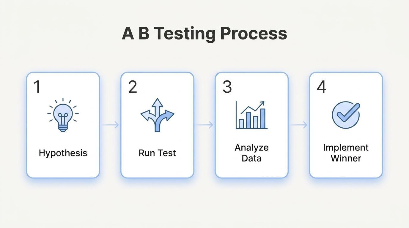
The landing page elements you should test first are those closest to the conversion action: headlines, CTA button copy, hero images, and form length. These elements directly influence whether a visitor takes action or bounces.
Prioritization matters because most tests fail. According to Nielsen Norman Group, only one in every seven A/B tests produces a winning result, and that rate drops further without a strong, data-based hypothesis. Starting with random design tweaks wastes traffic and time.
High-priority elements to test first include:
For form optimization specifically, Baymard Institute's checkout testing found that an ideal flow can use as few as 12 to 14 form elements, enabling a 20 to 60 percent reduction for most sites. That same principle applies to landing page lead forms: fewer fields generally mean less friction.
You should run a landing page A/B test for at least one to two full weeks, even if you reach your target sample size sooner. Shorter windows risk capturing skewed data from day-of-week patterns, pay cycles, or promotional spikes that do not reflect normal visitor behavior.
According to Nielsen Norman Group, A/B tests need this minimum duration to account for potential fluctuations in user behavior. Ending a test early because one variant "looks like it's winning" is one of the most common mistakes in conversion optimization. The apparent winner may simply reflect a temporary traffic pattern rather than a genuine performance difference.
You interpret conversion lift vs statistical noise by checking whether your result meets a predefined statistical significance threshold, typically 95%. A conversion lift is meaningful only when the probability of it occurring by chance falls below that threshold.
Three inputs determine whether your sample size is sufficient: the baseline conversion rate, the minimum detectable effect you want to identify, and your chosen significance level. Without defining these before launch, you risk either calling a test too early or running it far longer than necessary.
In practice, small percentage differences between variants often reflect normal fluctuation rather than a true winner. If variant B shows a 0.3% lift over variant A but the confidence level sits at 78%, that result is noise. Patience and statistical rigor separate teams that actually improve conversions from those that chase false positives.
With a testing framework in place, the next step is tracking the right metrics to measure overall landing page performance.
You measure landing page performance by tracking conversion-focused metrics, benchmarking against industry standards, and using analytics tools that connect visitor behavior to outcomes.
The metrics that define a high-converting landing page include:
Tracking these metrics together reveals whether a page attracts qualified traffic and moves visitors toward a specific goal. Isolated metrics mislead; a low bounce rate means little if the conversion rate is also low.
You set realistic conversion rate benchmarks by comparing your results against industry-specific data rather than universal averages. According to Statista, the average conversion rate across all e-commerce sites is under 2%, but performance varies dramatically by vertical. Skincare e-commerce converts at approximately 2.7%, while luxury apparel sits at just 0.4%.
These gaps make blanket targets unreliable. A "good" conversion rate for a luxury fashion brand would be a failing grade in skincare. Start by identifying your vertical's median, then set incremental improvement goals of 10 to 20 percent above your current baseline. Treating someone else's benchmark as your own target is one of the most common missteps in conversion optimization.
The tools you need for landing page analytics fall into three categories:
No single tool covers every dimension. Web analytics shows what happened; heatmaps show where attention goes; A/B testing confirms why one version outperforms another. Connecting these layers to a shared data source, rather than reviewing each in isolation, is what separates teams that optimize effectively from those running on assumptions.
With clear performance metrics in place, the next step is identifying the mistakes that undermine them.
Common mistakes that lower landing page conversion rates include competing messaging, slow mobile load times, and forms that request too much information. Each error introduces friction that drives visitors away before they convert.
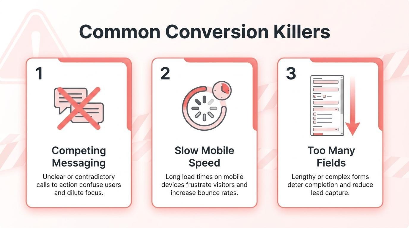
Competing messaging dilutes conversions by splitting visitor attention across multiple offers, headlines, or calls to action on a single page. When a landing page tries to promote several products, highlight unrelated benefits, or present more than one primary CTA, visitors lose clarity on what action to take.
Effective landing pages align every element around one goal. The headline, supporting copy, imagery, and CTA button should reinforce a single offer. According to the Unbounce Marketing Glossary, message match describes how well landing page copy and design matches the ad that brought the visitor, serving as a critical component for ad success. When that match breaks down because the page introduces competing narratives, bounce rates climb and conversion rates drop.
Stripping away secondary offers is one of the fastest fixes available. If a page needs to serve multiple audiences, build separate landing pages rather than cramming everything onto one.
Slow mobile experiences kill landing page results because mobile users abandon pages that fail to load quickly. Smartphones account for over 78% of retail website visits worldwide, according to Statista. Despite this dominance, mobile performance consistently lags behind desktop.
A study published in MDPI's Analytics Journal found that mobile mean first contentful paint reached 4.819 seconds, while desktop averaged just 1.268 seconds. That gap means mobile visitors wait nearly four times longer to see meaningful content. Every additional second of delay increases the likelihood of abandonment.
Key factors that slow mobile landing pages include:
Prioritizing mobile speed is no longer optional; it is the baseline for protecting conversion rates on the channel where most visitors arrive.
Asking for too much information hurts forms by increasing cognitive effort and abandonment before submission. Every additional field a visitor sees introduces friction, and friction is the enemy of conversion.
According to Baymard Institute, the average US checkout flow contains 23.48 form elements displayed by default, yet their large-scale testing shows an ideal flow can be as short as 12 to 14 form elements, making a 20 to 60% reduction possible for most sites. The same principle applies to landing page lead forms: fewer fields mean higher completion rates.
Practical steps to reduce form friction include:
Every field should earn its place. If removing a field does not prevent you from fulfilling the offer, it should not be on the form.
With these common pitfalls identified, the next step is building pages where your data infrastructure supports every conversion decision.
You build high-converting pages by unifying the data that informs them. The sections below cover what changes when CRM, storefront, and marketing share one data layer, followed by key takeaways for the entire article.
What changes is the accuracy and speed of every conversion optimization decision. When customer data from CRM, storefront, and marketing lives in one layer, landing pages can personalize offers based on complete purchase history, browsing behavior, and lifecycle stage simultaneously. Fragmented tools force marketers to reconcile data across systems before acting on it, which delays testing cycles and introduces segment mismatches.
According to the 2026 HubSpot State of Marketing Report, lead-to-customer conversion is the second most important KPI for marketers across businesses of all sizes. Improving that metric requires seeing the full customer journey in one place, not piecing it together from disconnected dashboards. A shared data layer eliminates the sync lag between ad platforms, email tools, and storefronts that quietly erodes personalization accuracy. For brands running at real volume, this is often the single biggest unlock hiding behind underwhelming page performance.
The key takeaways about high-converting landing pages center on five principles:
Speed, trust signals, and a single focused CTA reinforce each of these pillars. The brands that treat landing pages as living, testable assets, rather than static campaign collateral, consistently outperform those that build once and move on. Results may vary depending on implementation, industry, and scale.